
Animated Heatmap
By Mathieu Guglielmino, Sep 24 2023
Much of these last two weeks have been devoted to understanding both natural disasters which shook Morocco and Libya. In addition to the Washington Post and the Financial Times I mentioned last week, I will also mention pieces by The New-York Times and Reuters this week for comparison of how such an event is dealt with in high-pace news environments.
Unfortunately, there’s still a lack of French outlets in today’s edition, since I have found exactly… 1? chart on the subject, in a Le Monde video:
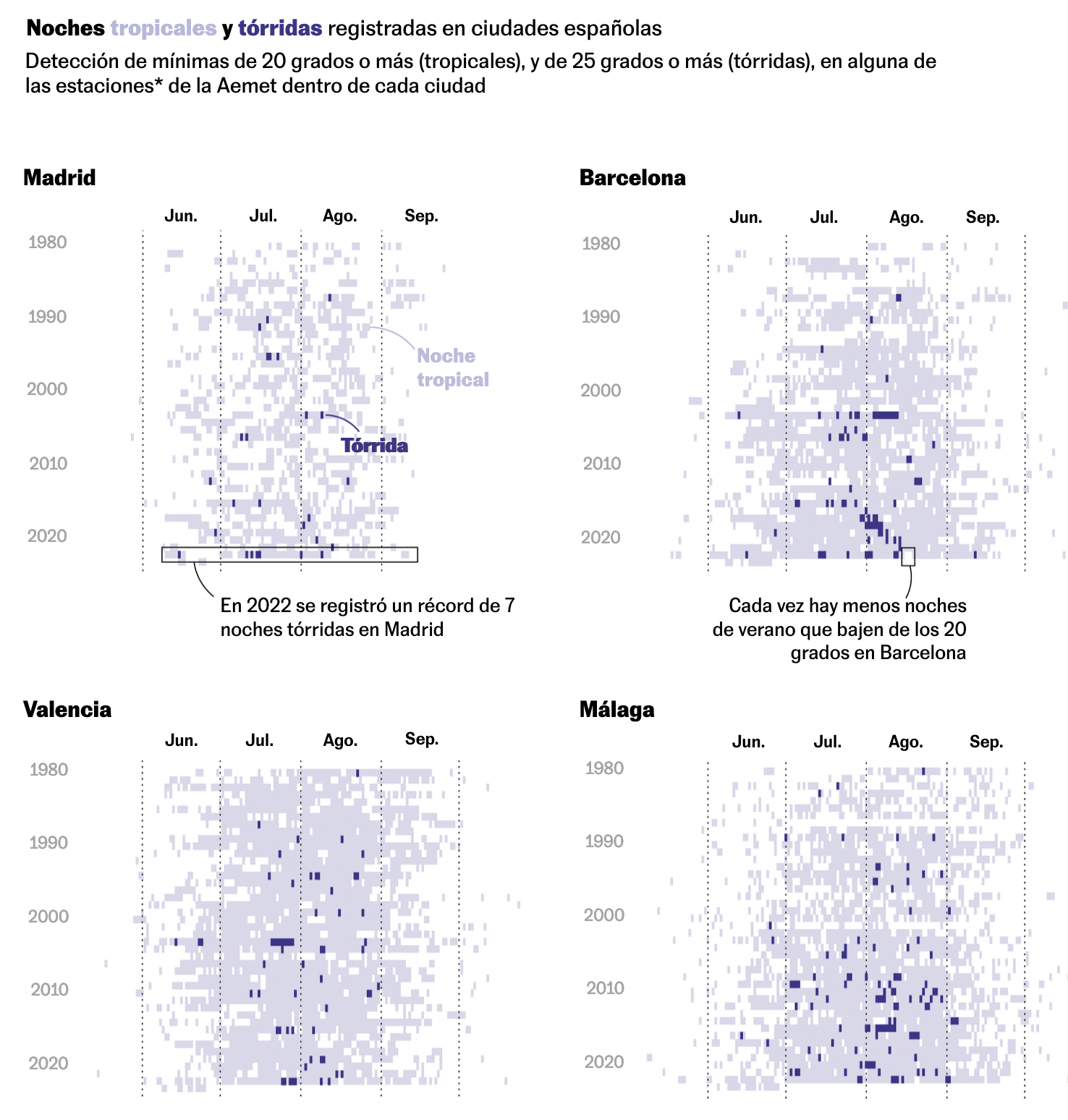
Another topic that has turned recurrent is global warming, and its numerous consequences on urban landscapes. Last year, the New-York Times explored how heat would change the Middle-East, El País how nights are increasingly hot, and Le Monde let you explore this year temperature in comparison of last years. Well, this week a special piece for The New-York Times by Pablo Robles explores how Singapore has engineered entire neighborhoods to deal with heat.
Finally, a miscellaneous of other topics I ran into 👍
Chart of the Week
Since it’s the first time I see this unusual combination, I figured it may interest you, readers, to check this heatmap + scrollytelling in SCMP. It displays temperature in Hong-Kong, with a focus on years by scrolling:

Energy and Environment
This SCMP article is a blend of charts and illustrations, with a pleasing use of scrollytelling to explore who would suffer most the consequences of a hot city:

 The captions pop-out on scrolling
Animations will spice up the whole of it:
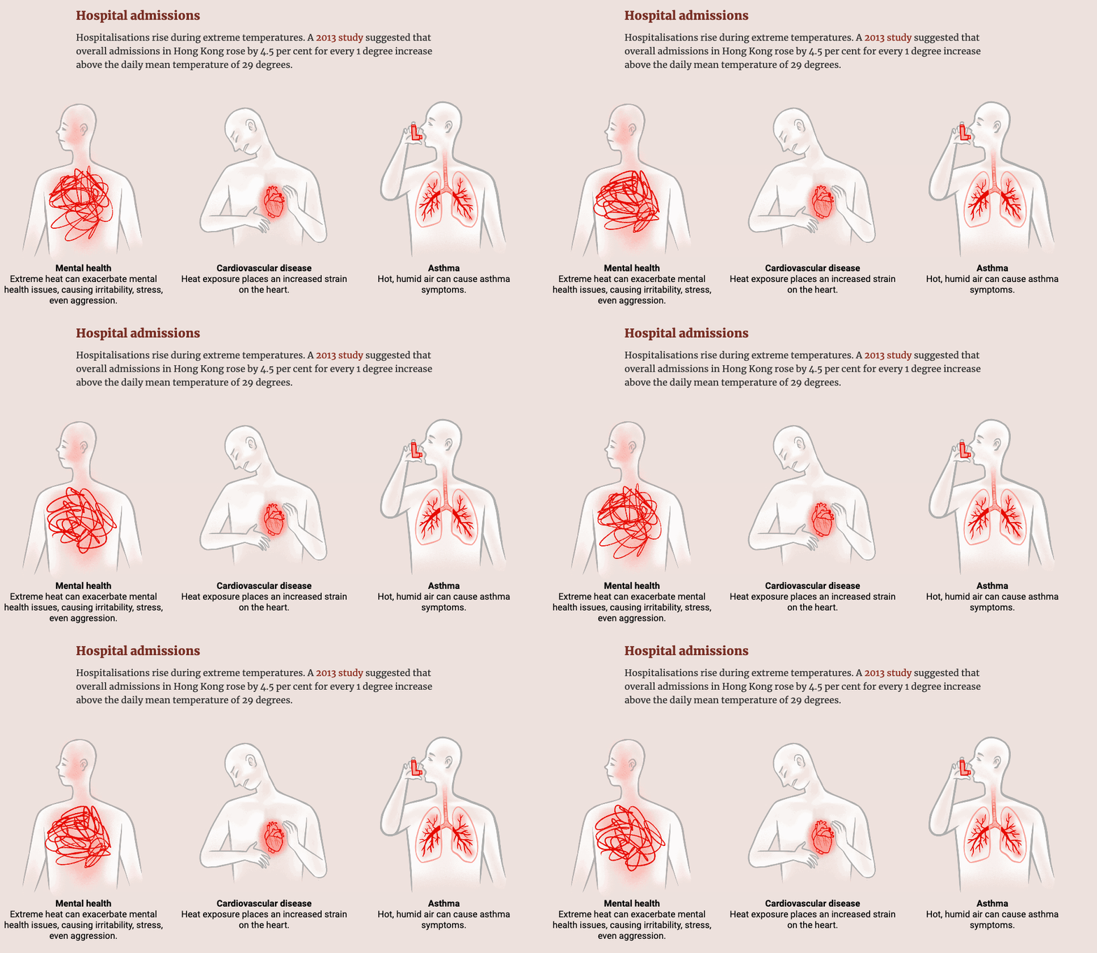 It’s very pleasing as a reader to be the recipient of such an attention to details
The charts that do appear are usual ones on the topic, declined on the very specific situation at Hong-Kong:

What best than a heat-map to plot hot days and nights? El País made the same decision a few weeks ago:
 Another recent article on ocean temperatures in El País made an intensive use of maps:
 I conclude this week Environment & Energy category with this McKinsey’s animation to better grasp what it means to meet CO2 emissions reduction goals by 2030:
 A pie (donut) chart done right (only 3 categories, sectors annotated, some actors represent most of the whole…).
Miscellaneous
I was surprised by the following chart, because I just couldn’t find how John Burn-Murdoch measured the economic position of a party on such a numeric scale. Is it a subjective take?
Charts are highly authoritative, and as readers we should remain vigilant as to what their author is trying to make them say, and how.

A divided world, by Bloomberg:


An official report on school inequalities in France came out with some striking data, and how the Republican school amplifies inequalities at each step of the education path:
 blue: students of modest origins / purple: privileged origins.
For the most socially rewarding track, which is “Seconde Générale et Technologique” (2011-2012), the difference between privileged (79% of initial cohort of students at the beginning of their education path end up here) and modest students (only 35.8%) is astonishing.
Morocco & Libya
These past weeks have seen unfold two major dramatic stories in Northern Africa: the Moroccan Earthquake and the flood in Libya. Both dramas resulted in thousands dead.
Every piece regarding this topic usually answers one or both question(s):
- Why did it happened?
- What are the consequences?
In the following I will explore articles by The New-York Times (Libya, Morocco) and Reuters (Morocco, Libya). You can check last week edition for The Washington Post and the Financial Times.
Morocco
 The New-York Times
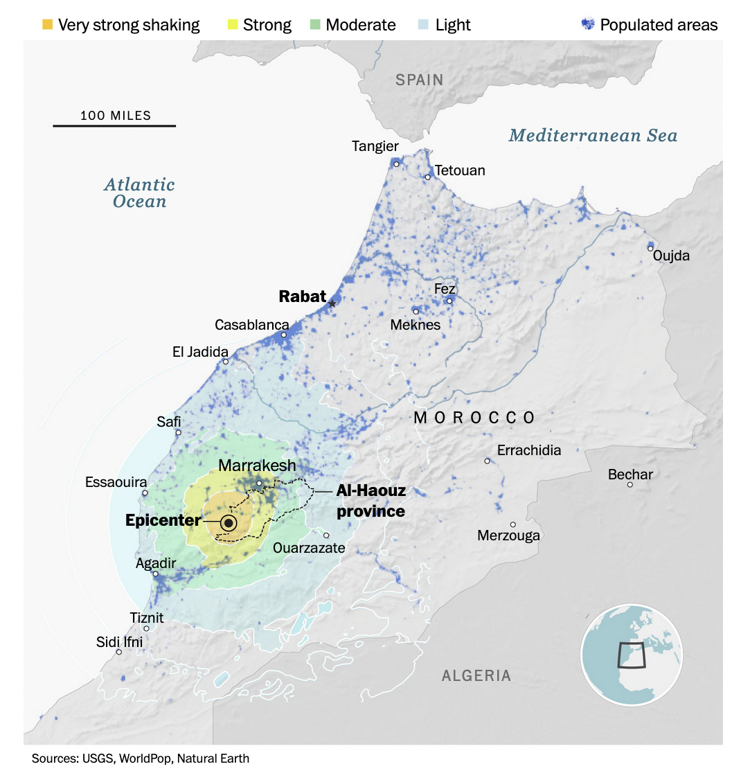 The Washington Post
 Reuters
Reuters dropped the geographic component, filtered the earthquakes with a magnitude > 5, but included the date:
 Reuters
Maps are completed in a majority of cases by satellite or drone views of before / after, such as this one:
The New-York Times
As for explanations, geology is the usual suspect:
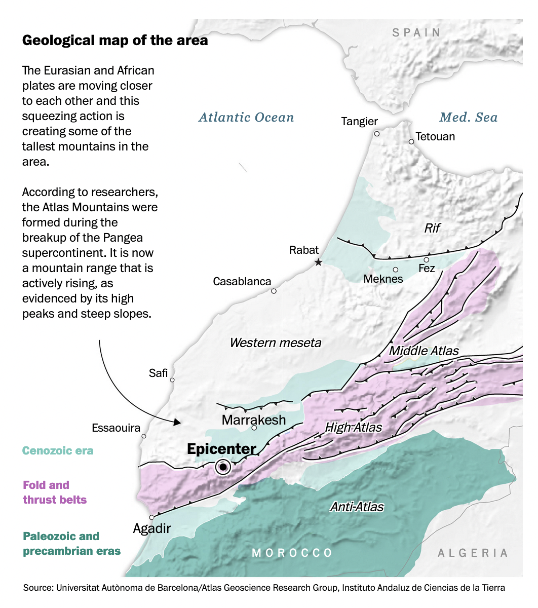 The Washington Post
Libya
The New-York Times consistently used the satellite-view comparison technique on both the Moroccan earthquake and the Libyan flood:
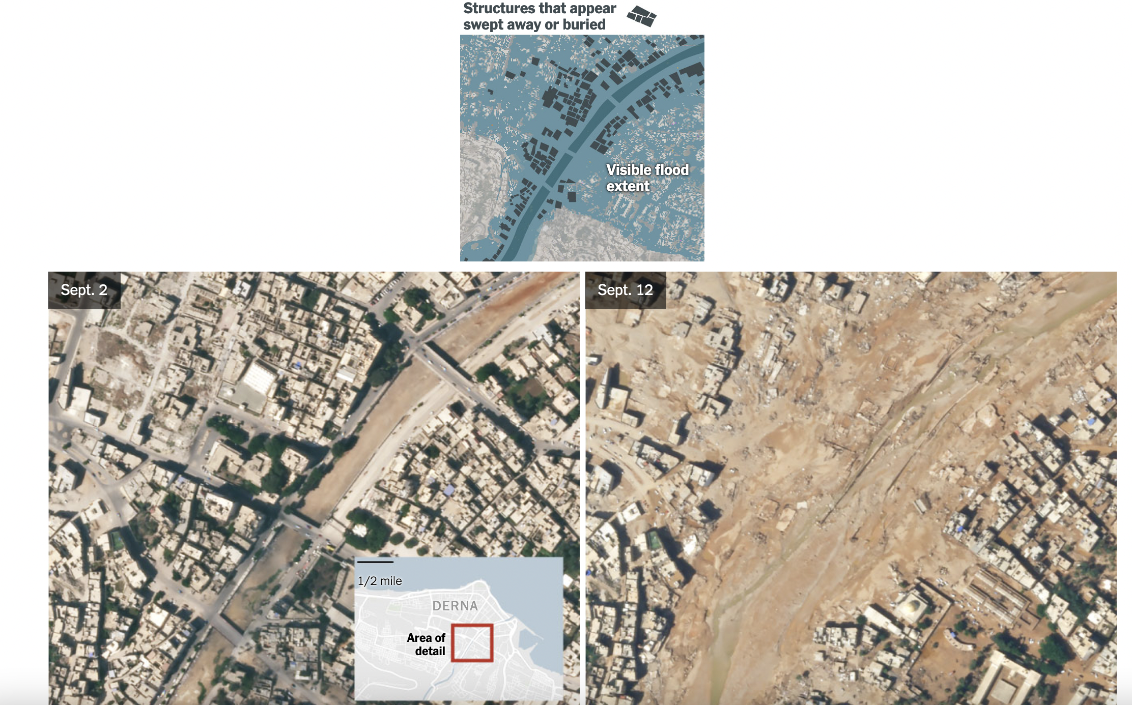 The New-York Times
Or at a larger scale:
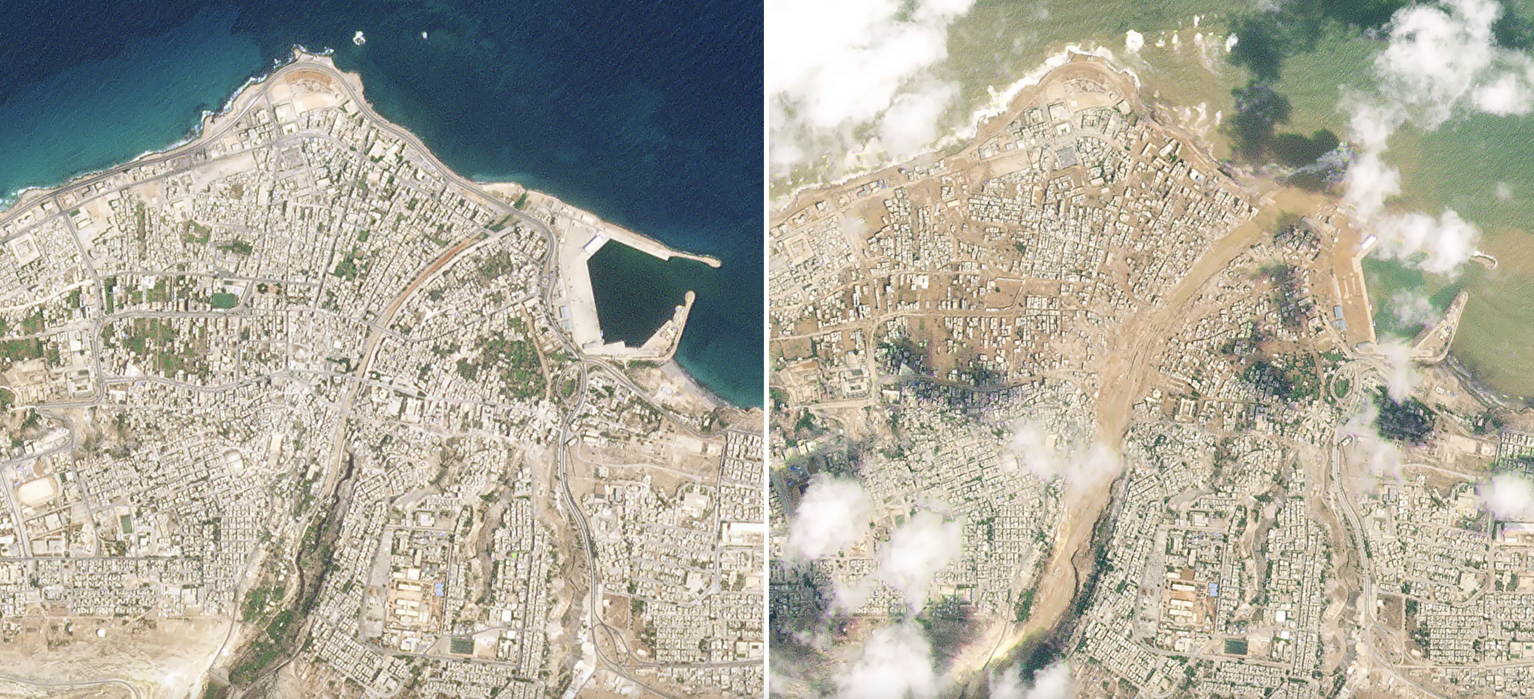 The New-York Times
Small multiples ⬆️ or animations ⬇️ are standard ways for such comparisons.
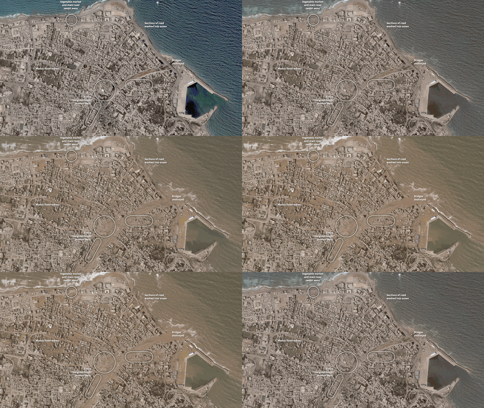 Reuters
Photos of places, such as this patchwork (Reuters), give a better sense of what the actual place looked like:
The New-York Times
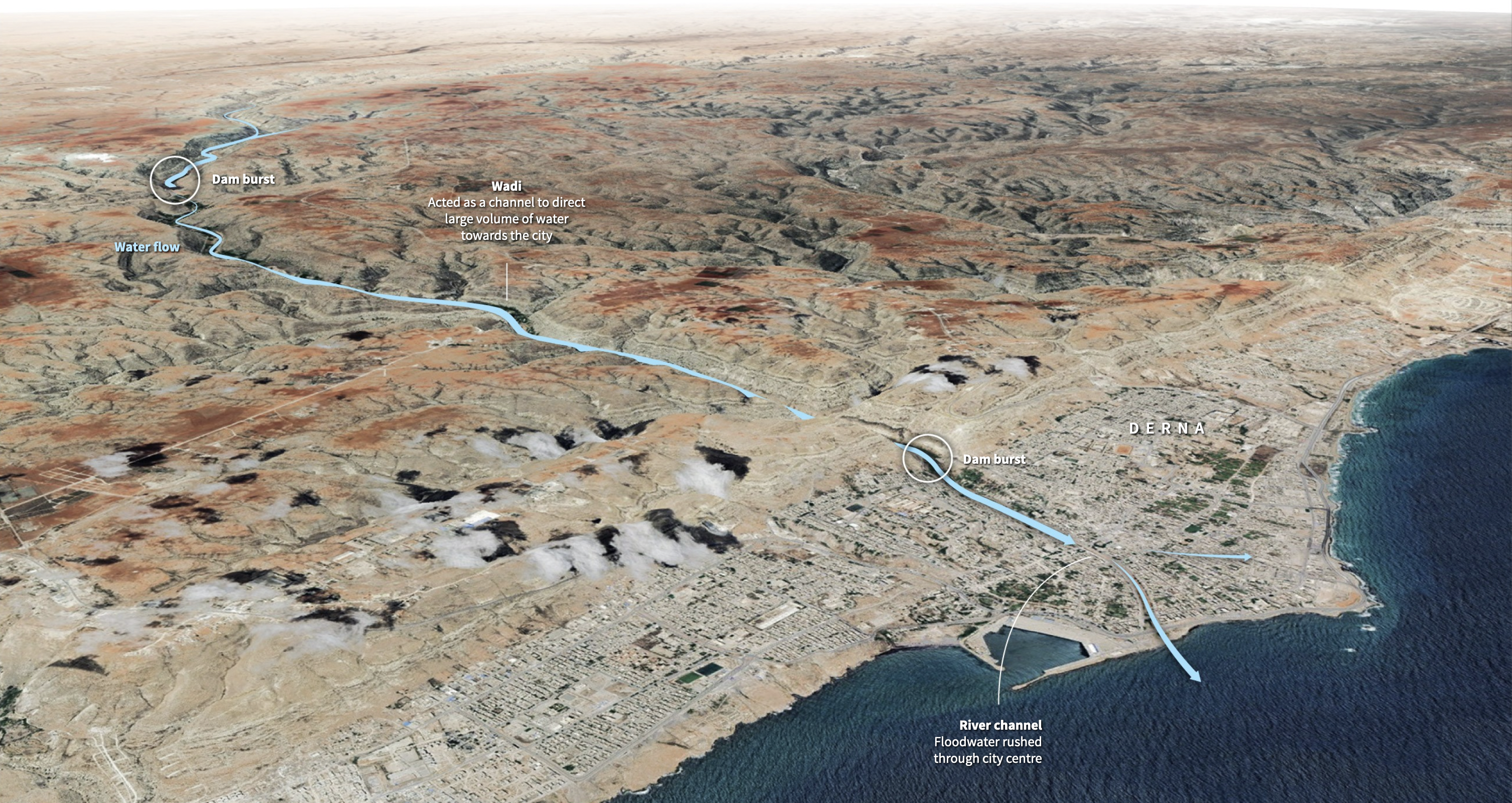
Some intermediary views between purely representational maps and photos are 3D-views such as these ones:
 Reuters
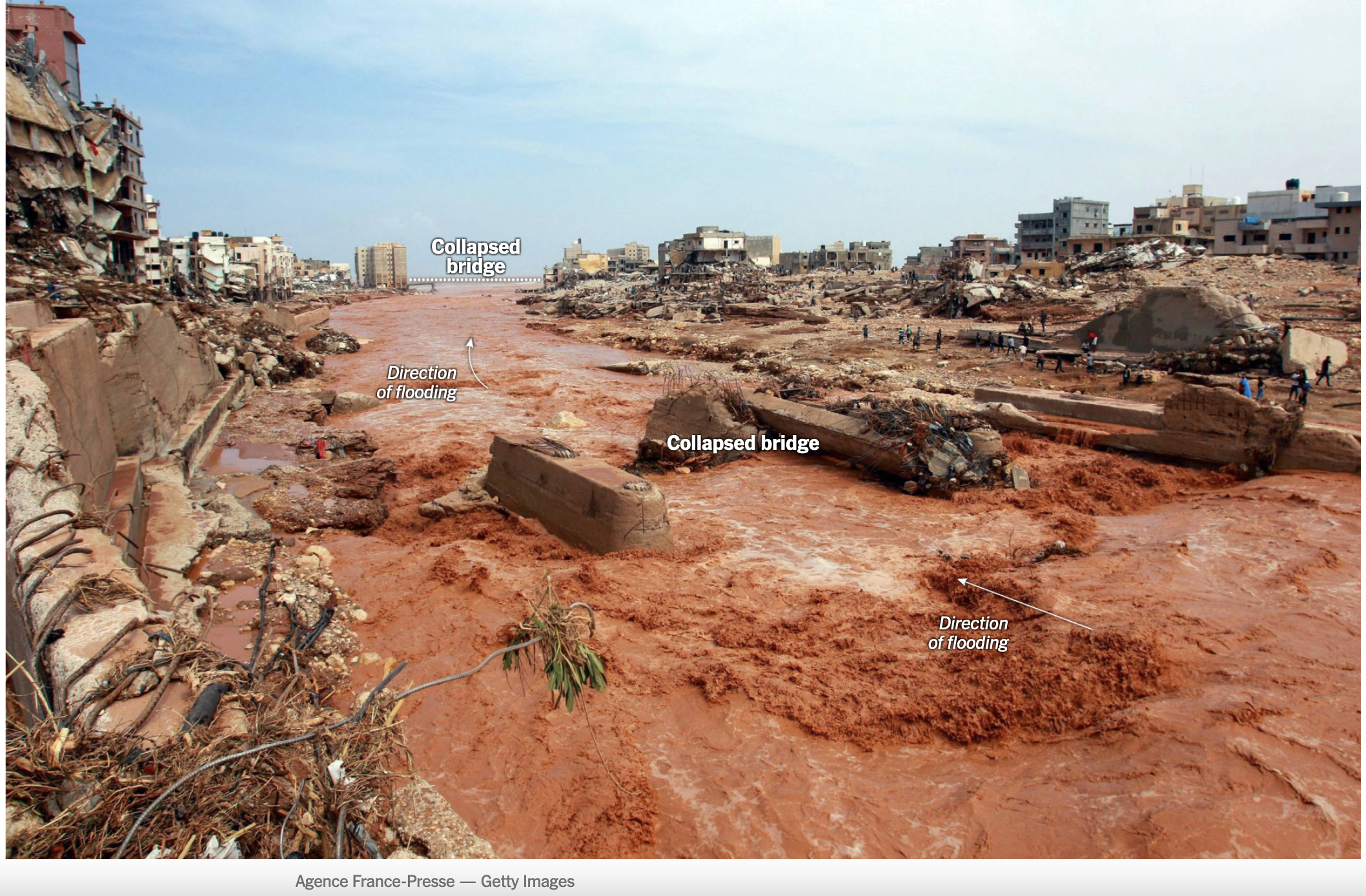 The New-York Times
Or this one I already mentioned last week among others:
The Washington Post
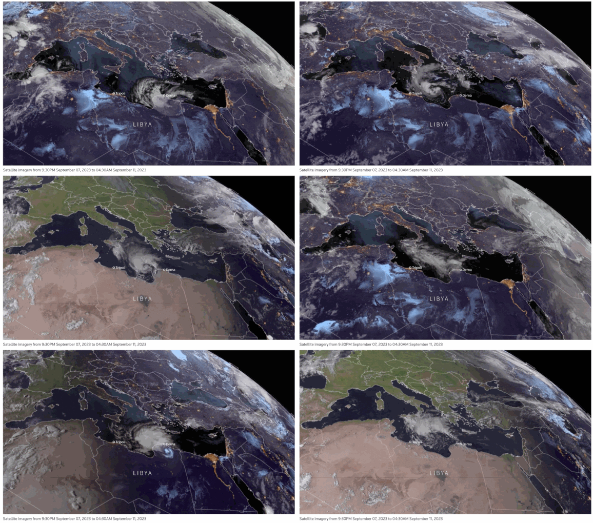
But when dealing with meteorological events, chances are you may have to consider at least part of the globe, such as this satellite video by Reuters showing the storm reaching Derna:
 Reuters
 Reuters
See you next week, Mathieu