
[VDS] French Schools Amplify Inequalities. Play It Yourself.
By Mathieu Guglielmino, Jan 29 2024
What do you think about the ability of the school system to reduce inequalities?
Well, in the case of France 🇫🇷, think no more: not only it does not reduce any inequalities, but actively increases them:
- 64% of privileged kids will access higher education;
- the number drops to 27% for kids born into poverty.
The lengthy details of the study are available in the report by France Stratégie “Poids des héritages et parcours scolaires” (2023, in French).
So I designed a game about it: Game of Chances: The Mother of Inequalities.
Today’s issue is about the lessons I’ve learned while designing and developing it.
The Game
 The final version of the game is a probabilistic simulation based on the previous data, which means that dropouts are sampled at a 7/10 ratio for the poor, only 3/10 for the rich.
The game is self-reflective, as its informs its own making along the way:
- By plotting each individual with maximum granularity (dots + lines),
- By displaying two half pie charts for the current dropout rates (rich on top, poor on bottom),
- By tracking how the dropout rate of poor kids change each turn (yellow line chart)
It also shows the number of individuals sampled since the beginning, and the average dropout rate for the whole dataset without distinction of social origin.
Why is it a game?
As they sample new individuals (central “+” button), the players may be prompted to make a choice:
- Will you study Latin?
- Will you buy books?
- Will you have role models? (not a choice really, but an event randomly triggered when a role model is sampled from college kids, 20% of the time)
After each choice, the status of the drawn individual is updated (dropout / college).
As time goes by, the player can alter the final data displayed.
Time to explain the rationale behind it.
Quest Charts Are Visceral Data Viz
Two weeks ago, I introduced quest charts, with an implementation of the traditional “Timeline” or “Flashback” game (read it here: Introducing Quest Charts). I picked this game because it uses randomness, represents time non-linearly (events appear in random order), and creates personalized and valuable knowledge to the player, all of which question the traditional paradigms of information visualization.
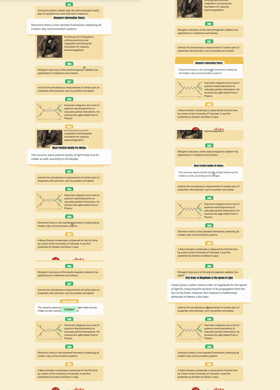 “The Science History of Light” (play it now)
I pretend games can be a way to have a more humanistic approach to data. This would demand a paradigm s hift from the traditional approach used in exact sciences, outlined for example in Giorgia Lupi’s “Data Humanism” manifesto, or in the 7 principles of “Data Feminism”.

What differs between the traditional and humanistic approach is that subjectivity, emotions, and an interpretative approach to knowledge are all valid in the latter, while often condemned in the former. Indeed, scientists are expected to reject all emotions and subjectivity in the making of knowledge, aim for rational objectivity, and share their findings in a top-down manner.
So two weeks ago, I outlined the following requirements a quest chart should check to be humanistic:
- experienced,
- uncertain,
- situated,
- co-constructed,
- emotive,
- repeated.
Let’s keep that in mind as I go back to the numbers we are interested about.
The Data
So, I was set to create a quest chart based on this one chart:
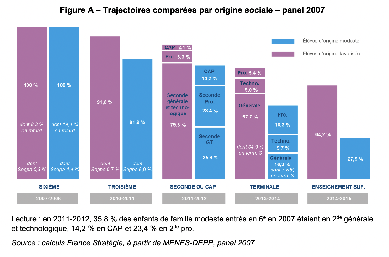 Trajectories by social origin. Access to higher education (enseignement sup.) = 64.2% of rich kids, 27.5% of poor kids
This reads as follow:
- You start with a cohort of 100 students in the first year of middle-school (6ème, ~11 years old),
- The gap widens each step of the way between rich and poor kids (first major gap at “Seconde générale”: 79% of rich kids vs 35% of poor kids)
- A share of these students will access higher education (enseignement sup.), 64% for rich kids, 27.5% for poor kids (right of the chart)
A game in this context should:
- give a visceral feeling of scale about what these proportions represent, how much unfavorable your odds are when you start poor ;
- allows for exploration of the parameters space.
Questions
Before I started, there were a few questions I needed to answer:
- who does the player play?
- what are the external factors?
- this is much similar to the statistician’s job, to find variables and features that would explain causation between phenomena;
- what are the player choices?
- what is the time unit?
Who Does the Player Play?
I could envision two different game plays: (a) you play rich and poor simultaneously on a split screen and compare the evolution, or (b) you switch role regularly. I settled on the latter, but I still think the former would make sense.
Playing students was a more natural choice than the parents or the government, which could have been interesting as well. However, students live on a shorter time scale (trends?), have limited effects on the system, and cannot generalize (individual trajectory).
To alleviate these issues, the chart can sample many data points (up to many hundreds, if necessary).
What Are the External Factors?
My initial list comprised:
- wealth,
- parents occupation,
- personal difficulties,
- cultural capital,
- role models,
- public investment
(in bold the ones I kept in the final version)
What Are the Player Choices?
The player choices update the chance of success. For example, Latin learners have 70% chance to get the high-school diploma, against 38% for non-learners.
- “active segregation” → Study Latin: some options, such as Latin or bilingual classes, effectively regroup privileged kids in one or two classes and reinforces segregation;
- cultural capital → Buy Books: The number of books at home is correlated to performance scores both in mathematics and French;
- Role Models → Automatic: More role models should improve your motivation
What Is the Time Unit?
Time is an essential matter here, as it is one of the foundational difference between games and static displays.
If the player is a student, it could make sense for the turn to be one year, but then a trajectory would take 7 turns to complete. Instead, I decided to consider a turn as “one student trajectory”, which may be updated by player input. Successive turns could be happening at the same time if the system parameters do not change (different students of the same year), or at different times (the system, and your odds, were updated somehow).
What’s Missing In the Final Version?
TL;DR: How other external factors such as motivation or public investments would influence the system, some narrative background, individual trajectories with more steps, more agency for the player, a goal.
I miss other usual suspects in the matter: money, motivation, educational activities, public investments…
In an early model I had thought of, the players had an amount of money (based on wealth), and were confronted to some difficulties they could overcome with money. If they couldn’t pay up all of their (random amount) of difficulties, the remaining difficulties would decrease the final probability of success. Since players can use money to buy books, and books in turn increase the probability of success, players must make a choice between solving difficulties or buying books.
The message in this case wouldn’t be about the mechanics really, but about creating an association in the player between causes and effects.
 One of the kids generated by Midjourney (not used in final version).
Narratives could be a nice addendum here. The nameless dots could be given names, goals, biographies and personalities. A background, fictional or factual, would foster emotional connections. AI could play some part here.
Such photo-realistic illustrations are at the end of a spectrum that includes more abstract representations, and I ultimately stayed at the other side completely with simple dots / squares.
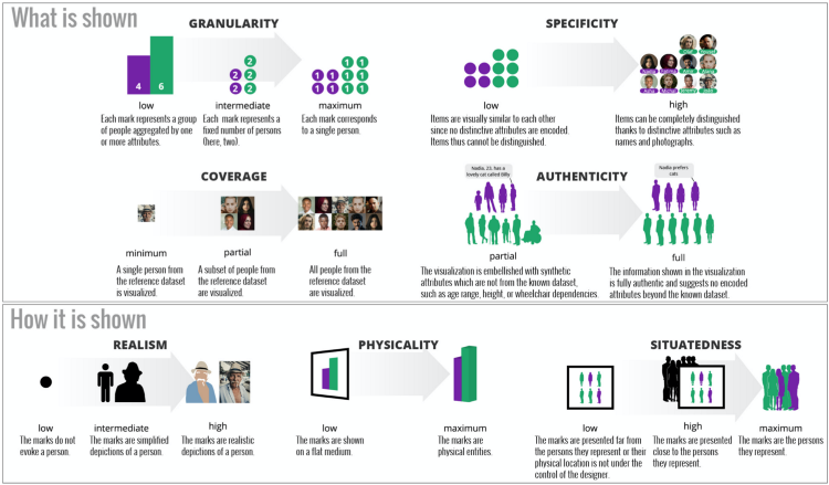 Anthropographics Design Space
Also, I regret we don’t follow some students in time. There are many checkpoints along the way, with various reasons for dropout, but as for now the trajectory happens instantly. A first idea I had was to start with some resources (money / motivation) and after 3-4 steps in which you had to consume these resources you must use what’s left to pay a fee to go to college (yes). You pass only if you have enough resources left.
Finally, the player lacks agency. Games are interesting because you have a choice to make under uncertain conditions, and you get to see how it plays out. In our case, it seems obvious that you will get better results if you study Latin or if you buy books (no?). The choice will influence the outcome, but there are no complex patterns to master or understand. Moreover, there is no explicit goal as to when the game ends (it could simply be: “dropout rate below 50%”).
A Game Design Framework
TL;DR: The benefits of using a framework to describe game mechanics is two-fold: (a) a high-level language to describe and explain design decisions, (b) to run a simulation of the system.
![]() Elements of a “machinations” diagram to model the mechanics of a game (transfer of resources). Resources are created by sources, are stored in pools, or distributed by gates.
Elements of a “machinations” diagram to model the mechanics of a game (transfer of resources). Resources are created by sources, are stored in pools, or distributed by gates.
It is close to impossible creating anything meaningful without a language to first represent it, and graphs have been used successfully to describe complex situations in engineering, chemistry, or architecture (one may say they are ubiquitous, list to be updated).
Machinations is a framework to model game mechanics via node-edge diagrams, using only a limited set of nodes and connections. With only 6 types of nodes and 2 types of connections, it can successfully model and run simulations of complex situations.
Example: Positive Feedback of Role Models
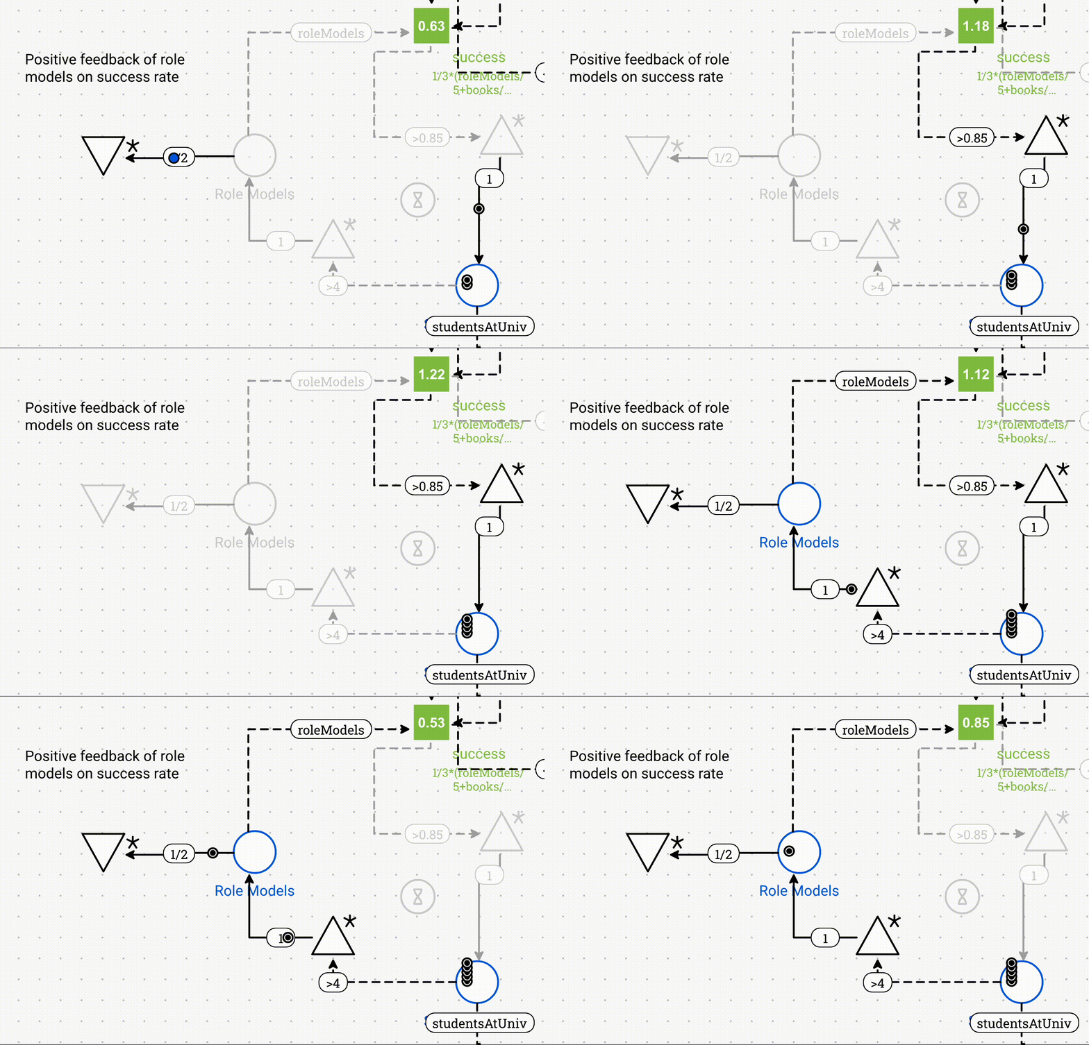 The positive feedback of role models (left circle) on the college kids (bottom right circle), via a “register” (green square)
I modeled our dropout situation with this framework to understand how it would unfold, and I will explain how I created a positive feedback between role models and the dropout rate.
Let us aggregate the knowledge about the external factors in a variable success, whose value will be used to determine if the turn is a success or not (green square, on top).
The amount of role models is an input of the success variable, and it will be higher if there are more role models.
When there are more role models from marginalized communities, there are more students from these marginalized communities going to college. But when less students are going to college, then there are less role models, which in turns reduces the number of college students.
I actually tried to model other the effect of other factors, and I ran some simulations:
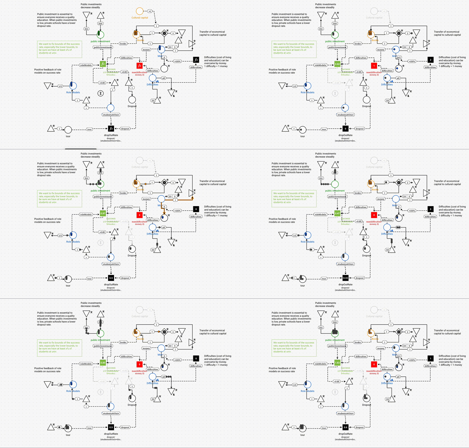 Machinations diagrams can be simulated. We can see the flow of resources between pools.
I didn’t make much use of the outputs of the game simulator in the final version because of lack of time to develop a more complex system. However, I found the framework highly expressive, and it has interesting ideas on how to represent such complex data.
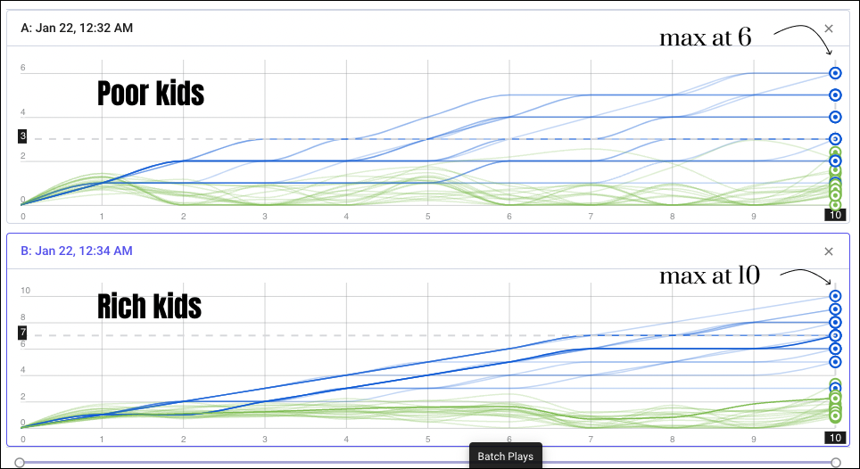
Also, it was instrumental to find the parameters of the model that yielded a most probable outcome close to the data (that is: 30% of poor kids go to college; 70% of rich kids). I had to test for various initial resources and threshold for success before finding a suitable solution.
 Diagrams can be simulated in “batch” mode, here with n = 10 runs, 10 time steps each. Left: Parameters for rich kids. Most probable outcome: 7 kids at uni. Right: for poor. Most probable is 3 kids at uni.
 You can see how some of your variables evolve in time (blue line: student at univ, red line: success variable)
Were we able to attach simulations (or models) to graphics, it would certainly be a paradigm shift. Additionally to the data itself, only a snapshot of reality, we could attach a diagram and demand the parameters be so that the simulation output statistically fit the data with controlled randomness.
The most simple diagram, completely random, would be the following one:
 A source emits one token in a pool each turn, and a random gate distributes resources from this pool to two other pools (proportion 3-7)
 “Advanced Game Design” (Ernest Adams, Joris Dormans) presents the “machinations” framework as well as many game design patterns expressed with this grammar
Lessons Learnt
- graphs (networks) can be used to describe game mechanics in terms of some input data,
- storytelling is bound to triggers associated to the state of the game. Traditionally, you position a piece of information in a story with an index (slide 1, 2, …). But instead of index numbers, the information is associated to triggers (16th turn; dropout rate > 90%; appears new role model…). Triggers may never happen, happen more than once, happen at the same time…
- games as narrative device create a tension between the message and how interesting the game is. A message seen 100% of the times would mean a deterministic game, in which the player actions have no consequence (boring). Games are not supposed to be exact repeatable statements, so we should learn to accept randomness.
- data viz displays posterior ; quest charts model prior. Should we invert Bayes’ formula to create quest charts?
Food for thoughts right?
Past Quest Charts
See you next week for a traditional digest,
Mathieu Guglielmino
2,222 words! (yes, that included)
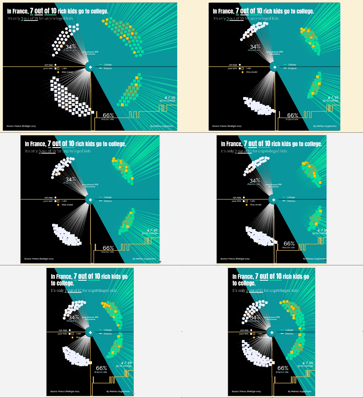 What a freak with his responsivity
